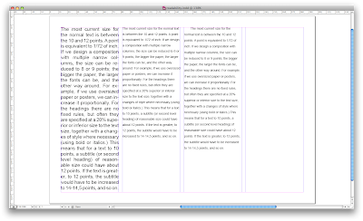
This session was all about learning how to make a paragraph readable. We were given a paragraph and instructed to make it fill the column so it was as readable as possible. We could do this however we wanted, but sticking to the same typeface. This was achieved by increasing point size, increasing the leading and fully justifying the text.
Our next task was to make the type as readable as possible and not to worry about filling the column. For this I changed the type size, leading and left aligned the paragraph. When fully justifying a piece of text it causes uneven spacing between words, which can change the pace it is read at. It is important that leading should be at least 20% larger than the text size for readibility however if it is too big it can cause unnatural pauses between lines.
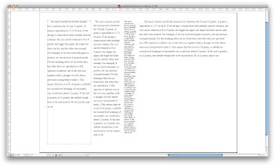
We then had a similar task but this time had to alter the type to fit in a 1 column, 2 column, 3 column and 6 column. The 1 column was particularly difficult, as we were aiming to get 5 words on a line. It proved to be quite a challenge without reducing the type size to something unreadable. When trying to fit type into a narrow space like this, condensed type faces are useful.
No comments:
Post a Comment